A new business or offer
Customers need to understand what you do and why it matters.

Positioning, language and design that make your value clear. Built around the customers you want to win.

We help businesses launch, reposition or bring an inconsistent identity together. The right scope starts with the problem you need to solve.
Customers need to understand what you do and why it matters.
The current message attracts the wrong audience or misrepresents your value.
The website, proposals and social content feel like different companies.
Services, products or locations need a clear relationship under the brand.
Some businesses need a focused refresh. Others need new strategic foundations.
We connect the business choices to how the brand speaks and looks. The approved strategy becomes the brief for creative work.
Audience, positioning, value proposition and reasons to believe. Architecture and naming when the portfolio needs them.
Core messages, voice, logo system, typography, colour roles and visual language.
A defined set of templates and launch materials for the touchpoints in your scope.
Illustrative — abstract compositions in Point Higher’s own tokens, not client artwork.
Strategy, identity and applications are one system: the position decides the brief, the brief decides the expression, and the expression is only ever applied to the touchpoints named in your scope.
Website builds, campaign management and ongoing content production have separate scopes. Brand assets give those teams a shared starting point. We establish that starting point with evidence from your business and your market.
We review the business, customer language and category conventions, then separate what the evidence supports from what still needs testing.
| Input | What we look for | Decision it informs |
|---|---|---|
| Business & offer | Capability, margin constraints, ambitions | What the brand can credibly promise |
| Customers & sales | Buying triggers, objections, choice criteria | Audience and message priorities |
| Competitors & category | Similar claims, visual codes, alternatives | Where and how to differentiate |
| Current brand & touchpoints | Recognition, inconsistency, usable assets | What to retain, change or retire |
We agree research depth before starting. Customer interviews, recruitment, surveys and additional markets require an explicit scope and budget. The evidence narrows the positioning choices before we write or design.
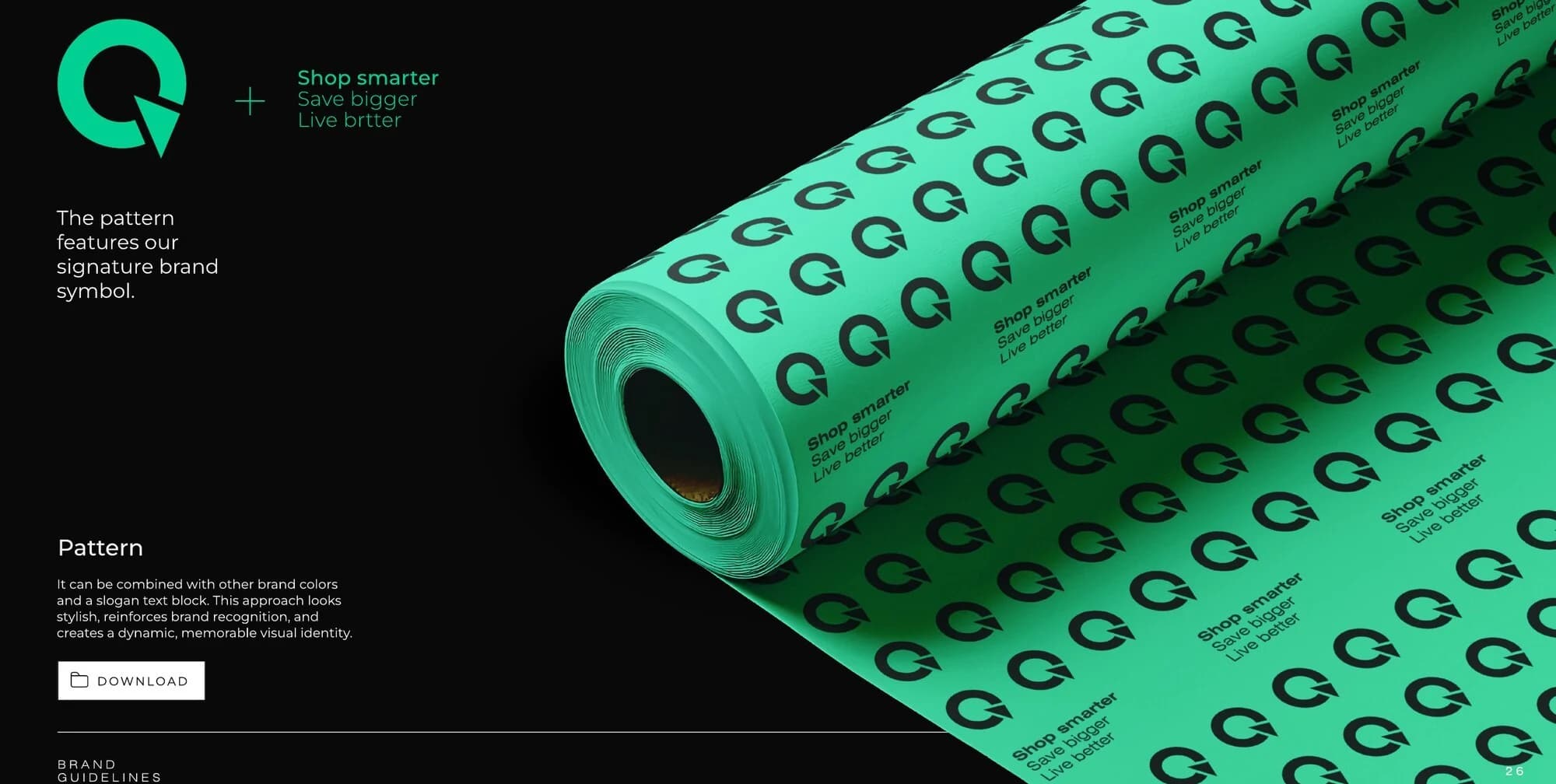
From our work for The Sequel, a US resale marketplace selling verified pre-owned goods, where part of every transaction supports a local charity.
One idea carries both halves of the offer — the product is pre-owned, the purchase funds someone else’s start. Price and purpose stop competing for the same sentence.
Value-driven buyers who want the saving first and the good deed second.
Verified condition grading plus a visible, trackable record of what each purchase funded.
Named charity partners, the share per transaction, and who audits the condition grades.
Client brief used with permission. Your approved positioning will rest on your own evidence, not an analogy to this one. With the position defined, the language can be written against it.
We define the message hierarchy and tone, then show how they work in a real communication format. The example continues the same brief.
Shop smarter.
Save bigger.
Live better.
Like-new quality for less — and nothing goes to waste.
“Sustainable solutions that empower conscious consumers.”
“Same product. Lower price. Less waste.”
Every claim in the hierarchy is checked against something the business can show: the condition grade, the saving, the named partner.
The voice becomes one of the criteria for the visual direction.
We present creative routes with an explanation of what each choice communicates, assess them against the approved brief, then refine the selected direction.
What we check: can the main idea be read quickly?
What we check: does it suit the intended customer?
What we check: can the business support the promise?
What we check: does it hold together across formats?
Before handover we also test the system mechanically: small-size logo use, one-colour versions, contrast, file formats and consistency across the agreed applications. Illustrative criteria — your approved positioning determines the actual creative brief. The selected direction becomes a system your team can reproduce.
Premium halal steakhouse and butchery, Dearborn, Michigan. Built pre-opening, from platform to printer-ready files.
| Element | In the delivered system |
|---|---|
| Scope | Strategy + Identity + Applications |
| Category | Hospitality / Retail |
| Type system | Two typefaces |
| Colour system | Five colours with print references |
| Delivered | Brand platform, tone of voice, logo family and icon, two-typeface system, five-colour palette with print references, brand pattern, packaging, stationery and wax seal, uniform, vehicle livery, interior signage direction and social templates. |
| The 1871 date | The 1871 date in the mark refers to the meat-trade lineage the brand draws on, not the year the business was founded — the wording is fixed identically across every asset. |
| Renders | Renders show approved design intent; final production follows the printer’s specifications. |
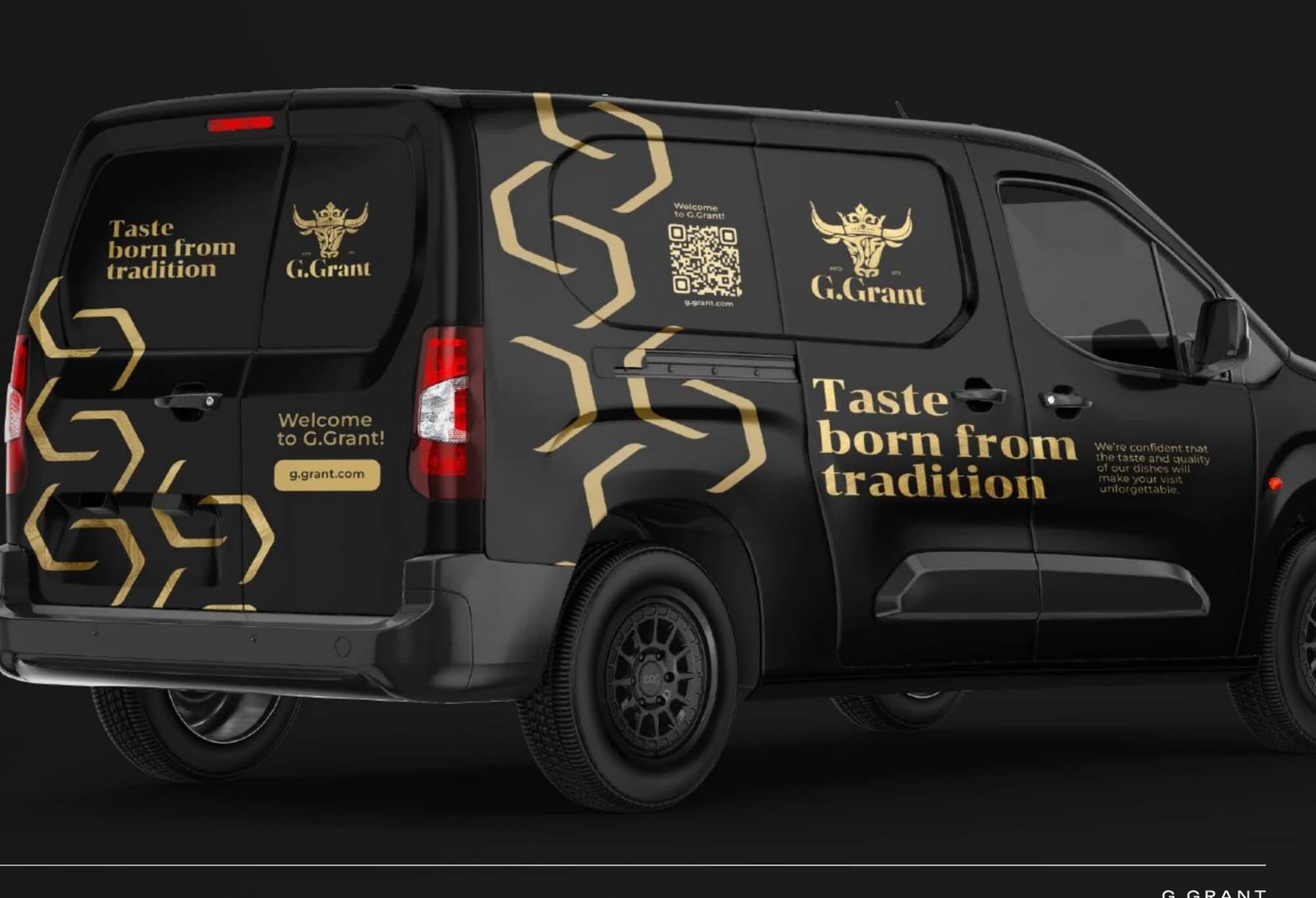
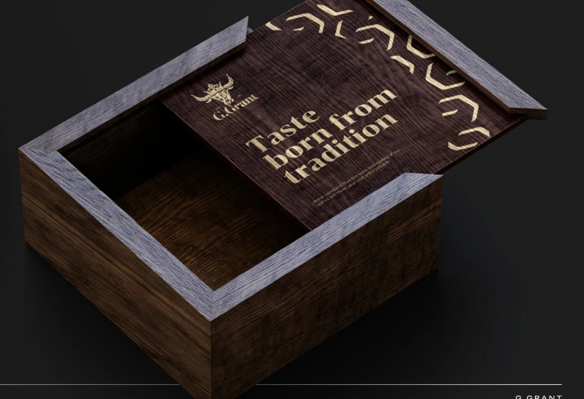
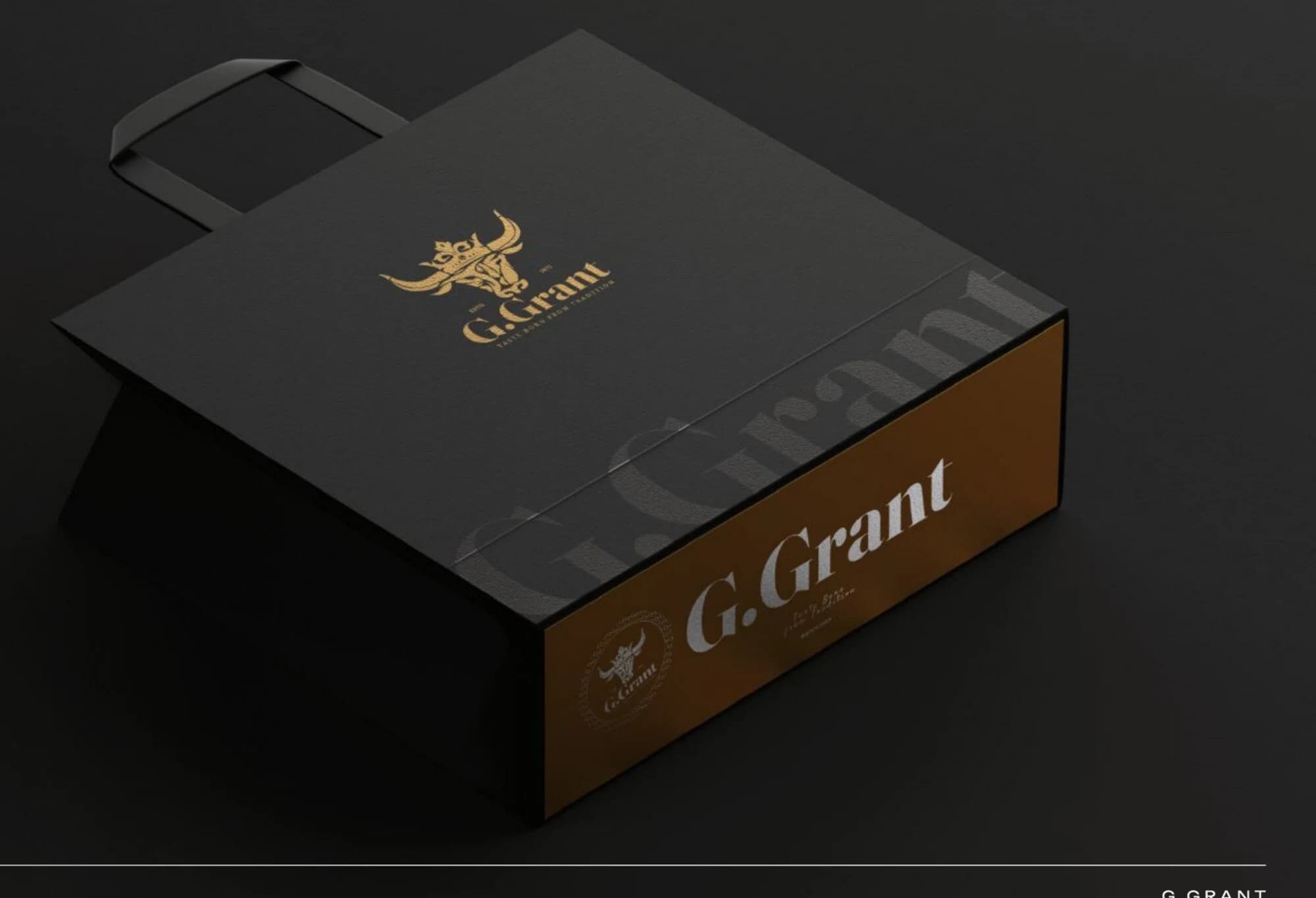
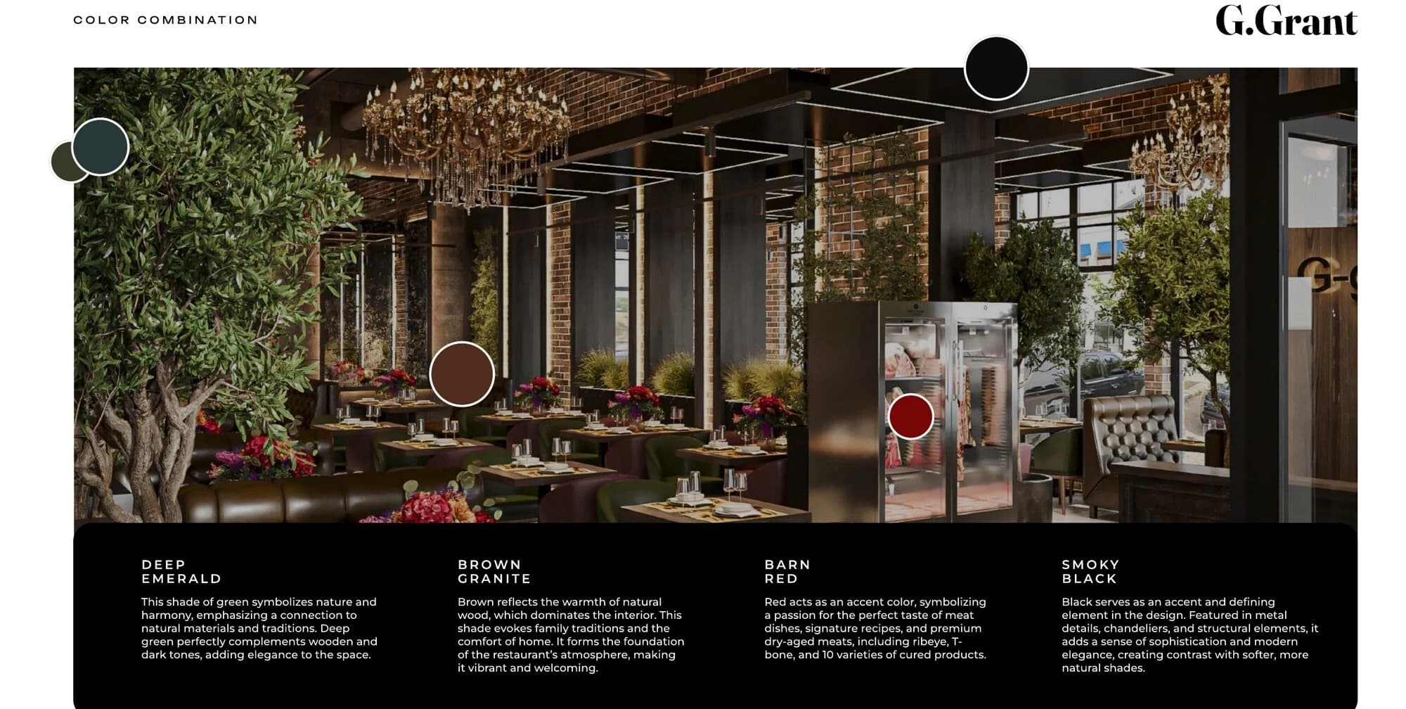
The same system, built for a digital-first business, looks like this.
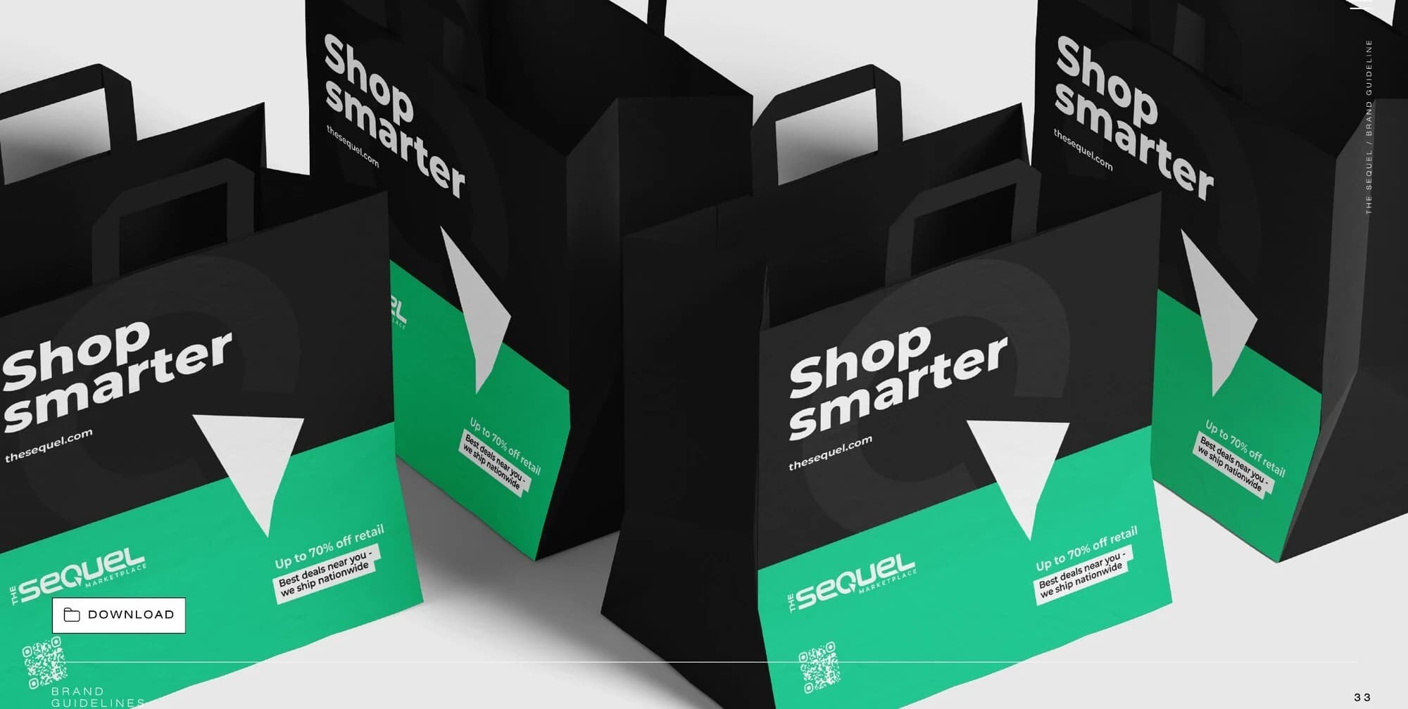
US resale marketplace. The positioning and language above come from this brief.
| Element | In the delivered system |
|---|---|
| Scope | Strategy + Identity + Applications |
| Category | Marketplace / E-commerce |
| Type system | Three levels, including a dedicated face for social |
| Colour system | Six colours with print references |
| Delivered | Brand strategy and core values, logo and standalone symbol, a three-level type system including a dedicated face for social, six-colour palette with print references, brand pattern, web direction, stationery, packaging and shipping materials, merchandise and a content style guide for social. |
| Renders | Renders show approved design intent; final production follows the supplier’s specifications. |
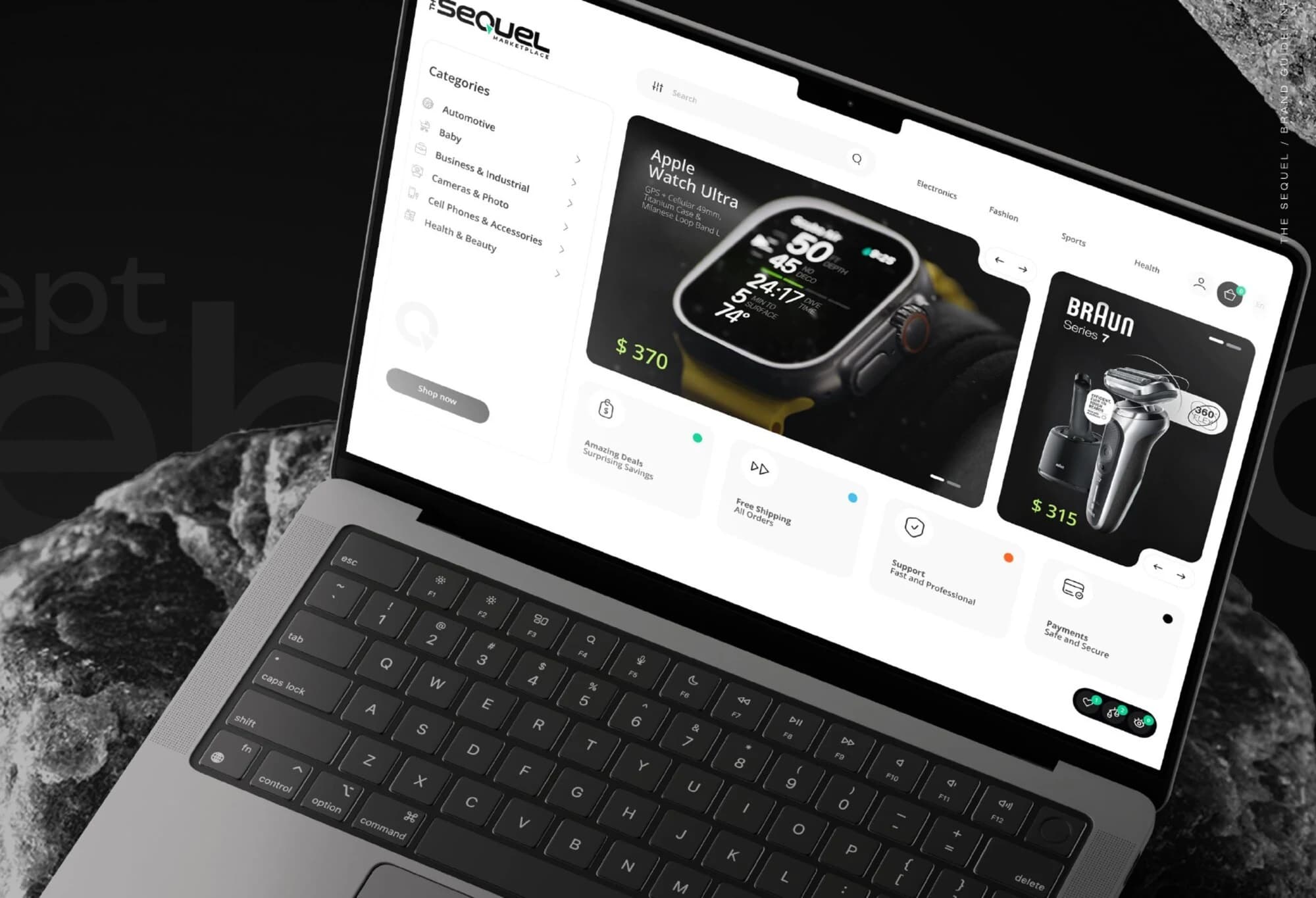
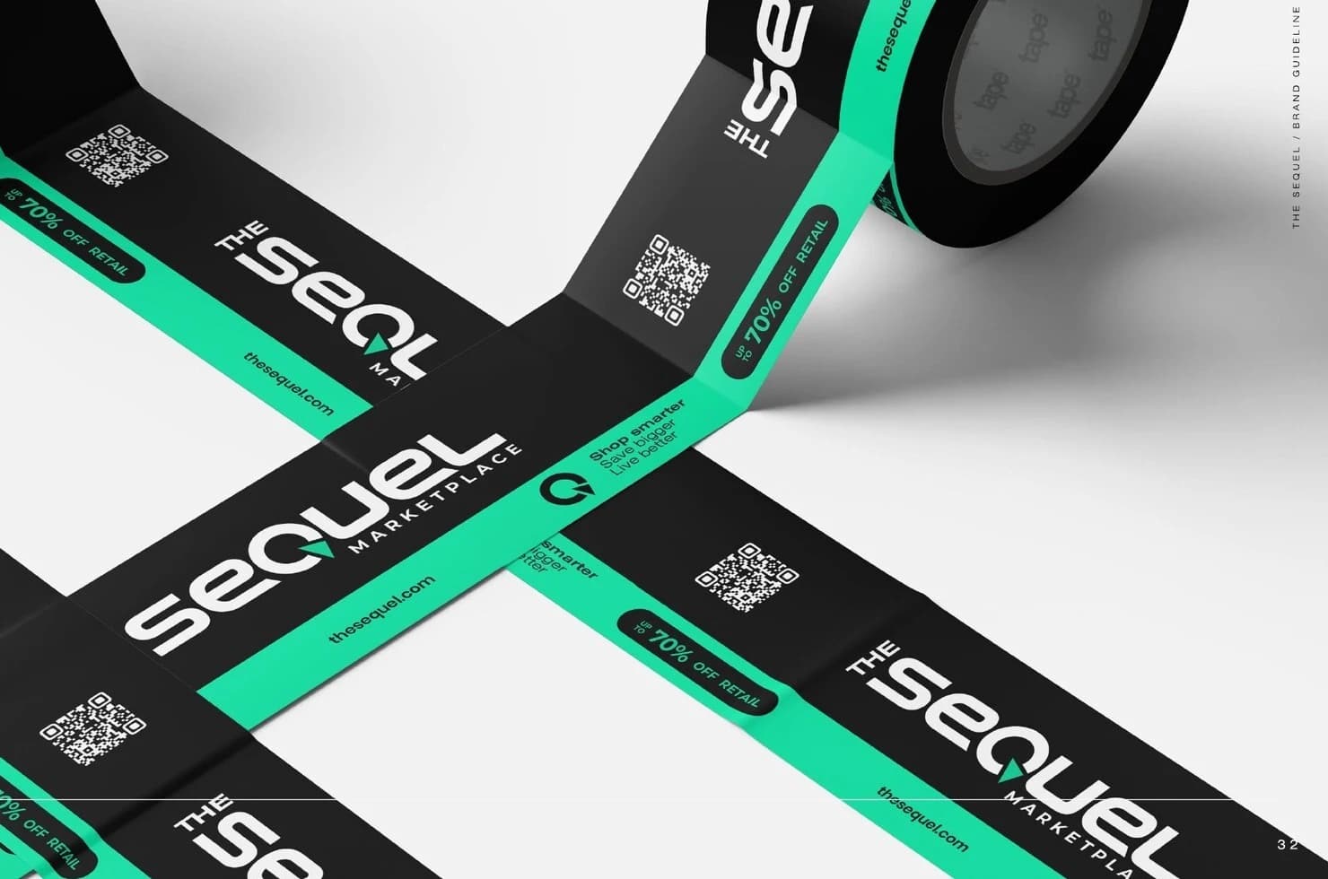
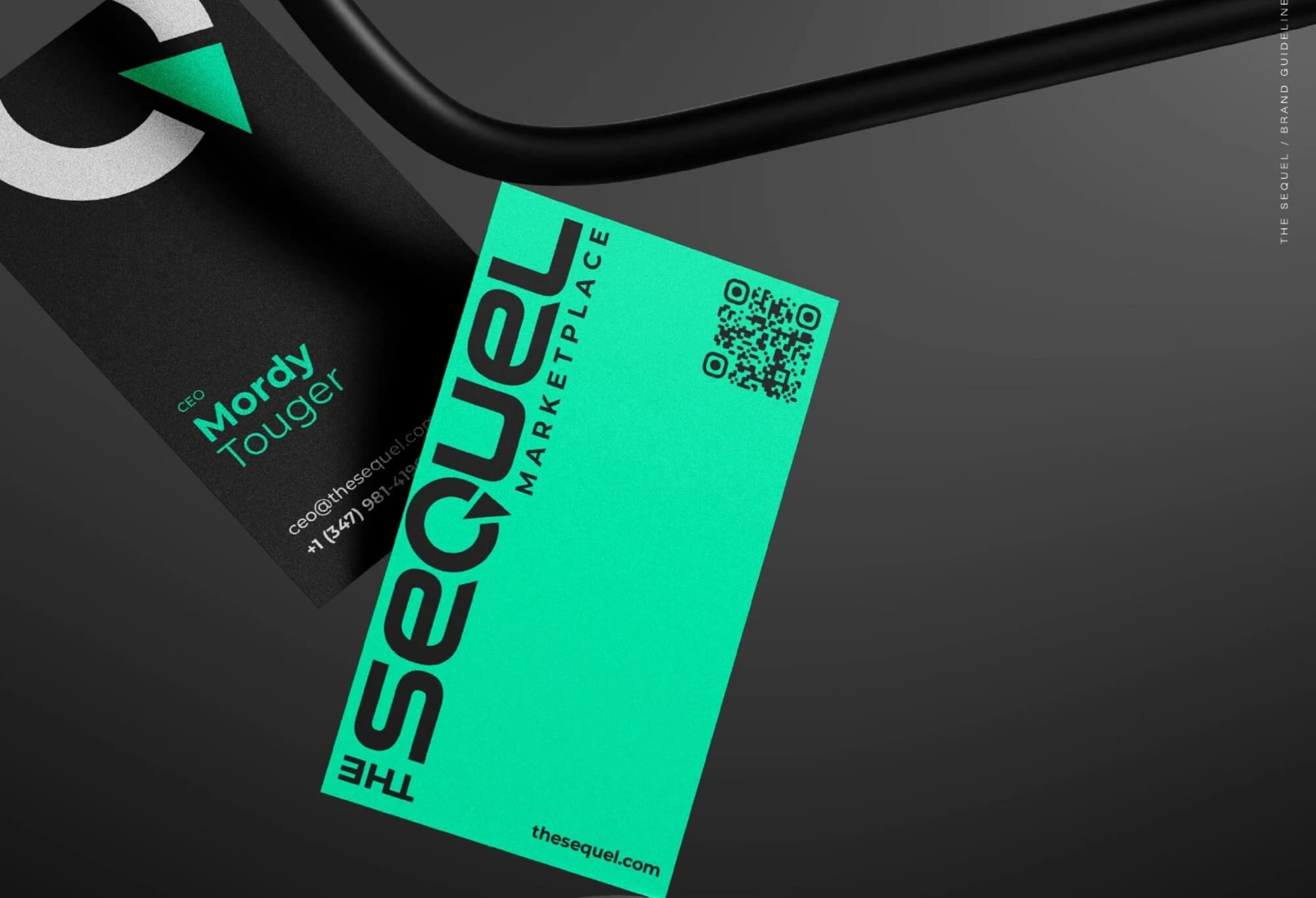
Whatever the category, the handover has to leave your team able to work.
Your scope lists the final assets, editable formats and usage rights. We hand over the approved system with examples and a walkthrough.
| Deliverable | What it contains |
|---|---|
| Brand strategy | Audience, positioning, value proposition and evidence requirements. |
| Verbal guidelines | Message hierarchy, voice principles and approved copy examples. |
| Visual guidelines | Logo rules, clear space and minimum sizes, colour roles, type, layout and image direction. |
| Asset library | Vector logos (SVG / PDF), PNG exports and agreed source files. |
| Application templates | Editable layouts for the formats named in the project scope. |
We document font and image licences separately. Print files follow the agreed printer specifications. Final rights and transfer terms appear in the agreement. A launch plan then assigns the right assets to the right teams.
The rollout plan prioritises customer-facing touchpoints and assigns owners. Your internal team or existing partners can implement the approved system.
Page messaging, design direction and brand assets.
Message territories and visual rules for campaign creative.
Language and brand context for content briefs.
Rollout priorities, ownership and ongoing governance.
Approved brand brief → positioning, core messages, visual rules and asset library
Implementation, media budgets, content production and ongoing management are separate services. We avoid repeating approved strategic work. Each stage of the project resolves the next creative decision.
Weeks shown are for a full Brand Build. We confirm the schedule around scope, research access and your review availability. One client decision-maker consolidates feedback at each stage.
Review the starting point, gather inputs and agree the brief.
Approve the position and the core brand language.
Select a creative route and refine the identity in context.
Finish the guidelines, assets and agreed applications.
Discovery is the first stage of the project, not a separate purchase. A stage does not start until the previous gate is approved; delays in feedback or inputs move the remaining dates by the same amount. The scope you choose decides how far the work goes after Discover.
You can commission the scope you need without buying every Point Higher service.
2–3 weeks. The name and recognition stay; the expression is inconsistent.
5–7 weeks. A new business, a new audience, or a position that no longer fits.
8–12 weeks. Several services, products or locations under one brand.
A new name for the business, a product or a line, chosen against agreed criteria. Legal trademark clearance is separate.
For when the brief needs more evidence than the standard diagnosis. We agree the depth, sample and budget with you before it starts.
One more editable layout beyond the formats in your scope — during the project or after handover.
Refresh is billed 50/50. Brand Build and Brand System are billed across three milestones. Prices exclude trademark clearance and legal services, font and image licences, printing, production and media.
Yes. We assess whether the issue is the mark, its use, or the positioning around it. Refresh exists precisely for that case.
We compare concepts against the approved brief, then refine the selected route within the agreed rounds. A new brief may change the scope.
You receive the agreed final assets and source formats under the contract terms. Third-party font and image licences remain separate.
Yes. We hand over guidelines and assets for your team and partners. Ongoing creative production and brand oversight are optional.
Branding changes what customers understand and remember. It does not, on its own, guarantee sales growth or explain a revenue change.
Tell us what you are launching or changing, and what customers need to understand about it.
Business goal + audience
Current assets
Priority touchpoints